This post was originally published on this site
The U.S. stock market is nearing a top, according to a leading indicator that is based on the trailing three-month returns of the S&P 500
SPX,
sectors.
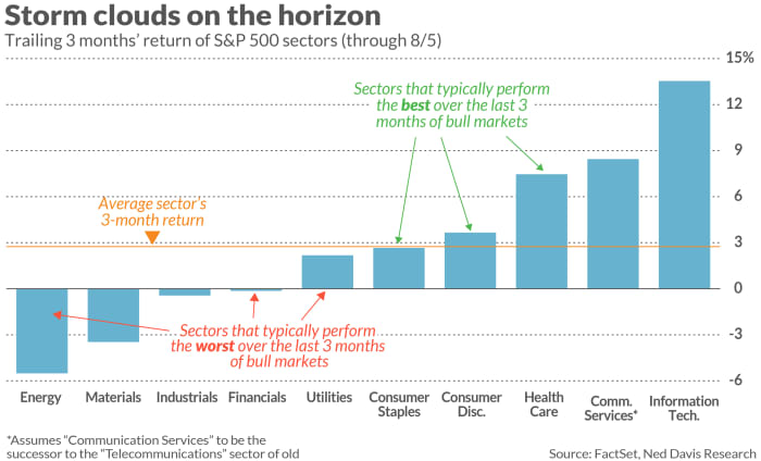
Over the three months prior to past bull-market tops, a fairly predictable pattern emerged of which sectors performed best and which fared worst. Currently, a ranking of the sectors’ recent relative strength lines up fairly close with that pattern.
This is a big change since mid-May when, as I reported, this leading indicator was not detecting any signs of imminent trouble. The sectors with the best trailing three-month returns at that time were not those that typically lead the market prior to tops, and the sectors with the worst trailing three-month returns were not those that typically lag.
Now, in contrast, there is a distinct correlation between the sectors’ relative strength ranking and the typical pattern that appeared in past tops.
According to research conducted by Ned Davis Research, Utilities, Energy and Financials are the S&P 500 sectors that have performed the worst, on average, in the final three months of all bull markets since 1970. As is clear in the chart below, these three sectors now are at or near the bottom in a ranking of trailing three-month returns.

In contrast, according to Ned Davis Research, Consumer Staples, Health Care and Consumer Discretionary are the sectors that have performed the best, on average, over the three months prior to past bull market tops. As the chart shows, these three have performed relatively well over the past three months.
To quantify how much the sector relative strength rankings have shifted in a bearish direction, consider the correlation coefficients that I calculated. This statistic ranges from a high of 1.0 (which would mean that there is a perfect one-to-one correspondence between a ranking of the sectors’ recent returns and the historical pattern) to minus 1.0 (which would mean a perfectly inverse correlation). A coefficient of zero would mean that there is no detectable relationship.
In mid-May, this coefficient stood at a significantly negative minus 0.66. Today, in contrast, it is a positive 0.67. This latest reading is one of the higher coefficients I’ve seen from my periodic monitoring of this indicator.
Needless to say, neither this (nor any indicator, for that matter) is guaranteed to work. One time that it was accurate was in April 2015, when my column on this indicator ran under the headline “leading indicators signal a market top.” A bear market began one month later, according to the bear-market calendar maintained by Ned Davis Research. The correlation coefficient between the relative strength ranking that then prevailed and the historical pattern stood at 0.43; the current reading is higher and so even more bearish.
Mark Hulbert is a regular contributor to MarketWatch. His Hulbert Ratings tracks investment newsletters that pay a flat fee to be audited. He can be reached at mark@hulbertratings.com
Plus: As Congress clashes over borrowing and debt, gold is likely to beat stocks

