This post was originally published on this site
https://i-invdn-com.akamaized.net/trkd-images/LYNXMPEH060XW_L.jpg
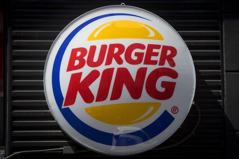
(Reuters) – Burger King has redesigned its brand including its logo, food packaging and restaurants in order to reflect improvements such as eliminating preservatives, the fast food chain announced on Thursday.
“We’ve been doing a lot in terms of food quality and experience,” said Fernando Machado, global chief marketing officer of Restaurant Brands International (NYSE:QSR), which owns Burger King. “We felt that putting a wrap around all that with an upgrade of our visual identity would help signal to our consumers that this is a brand that’s evolving.”
The rebranding, Burger King’s first in over 20 years, includes a new logo with a rounded font that mirrors the shape of its burgers and other menu items.
Bold colors in shades of brown, red and green are a nod to Burger King’s flame grilling process and its use of fresh ingredients, the company said.
Burger King earlier this year announced it would remove all artificial colors and preservatives from its signature Whopper burgers as fast food chains are increasingly introducing healthier options to follow consumer tastes.
The company’s famously quirky plastic-faced mascot – The King – won’t be going anywhere despite the rebranding.
“We love him the way he is, and he will continue to be weird,” Machado said.

